Moving a financial brand to a new name without losing its clients' trust
When Old Mutual became Skandia in Colombia, every touchpoint had to change without spooking investors. I was part of the in-house team that led the transition, then built the kit that kept the new brand consistent.
500+
touchpoints rebranded
during the Old Mutual transition
4
years in-house
on the brand design team
60%
faster production
after the internal brand kit
01
The client
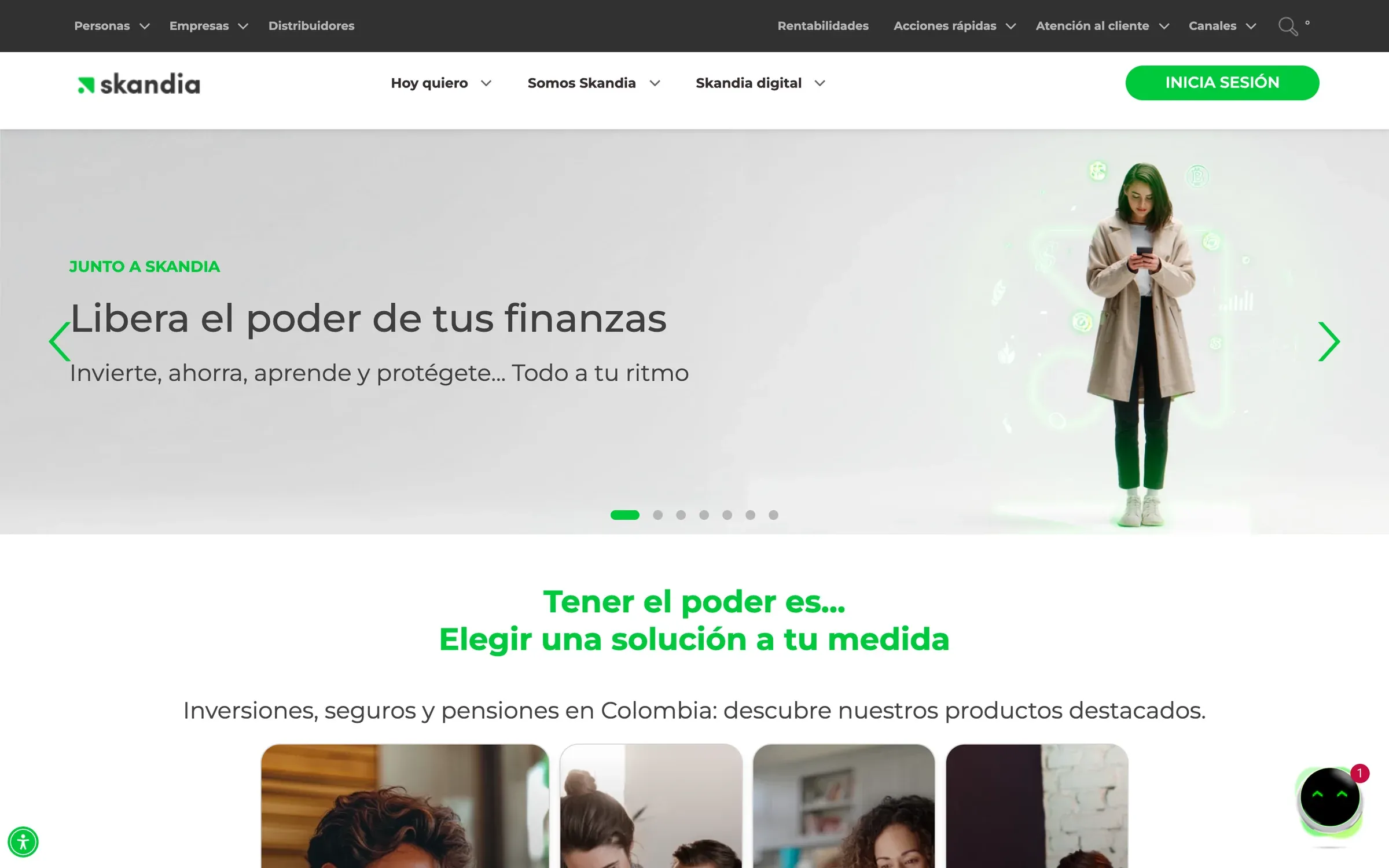
Skandia is one of the largest asset managers in Colombia, handling pensions, savings and investments for individuals and companies. It operated as Old Mutual until the group changed hands. I worked there in-house as Brand Design Specialist from 2018 to 2022.
02
The challenge
Changing a bank-grade brand is not like changing a startup logo. People have their retirement money there. Every statement, app screen, landing page and branch sign had to switch to Skandia at the right moment, and the new name had to feel as solid as the old one on day one. On top of that, marketing needed campaigns shipped every week, and an in-house team can't debate the brand on every piece.
03
The process
The transition ran in waves, and I focused on keeping design consistent while volume stayed high.
- 01Inventory. Every touchpoint that carried the old brand, ranked by visibility.
- 02Transition design. New versions of each piece, rolled out in coordinated waves.
- 03Brand kit. An internal toolkit of templates and rules so any team could produce on-brand work.
- 04Operational design team. I ran the day-to-day team handling campaign and digital requests.
04
The solution
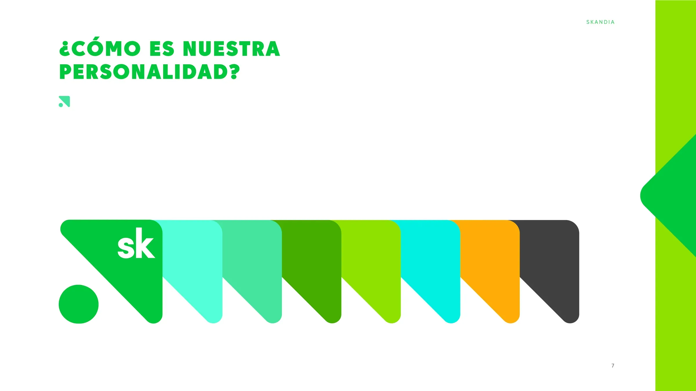
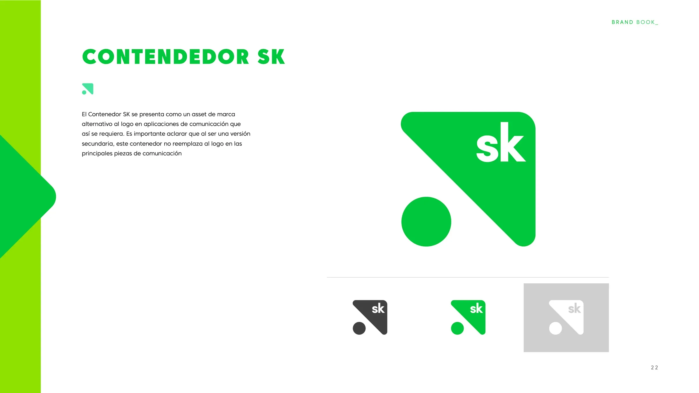
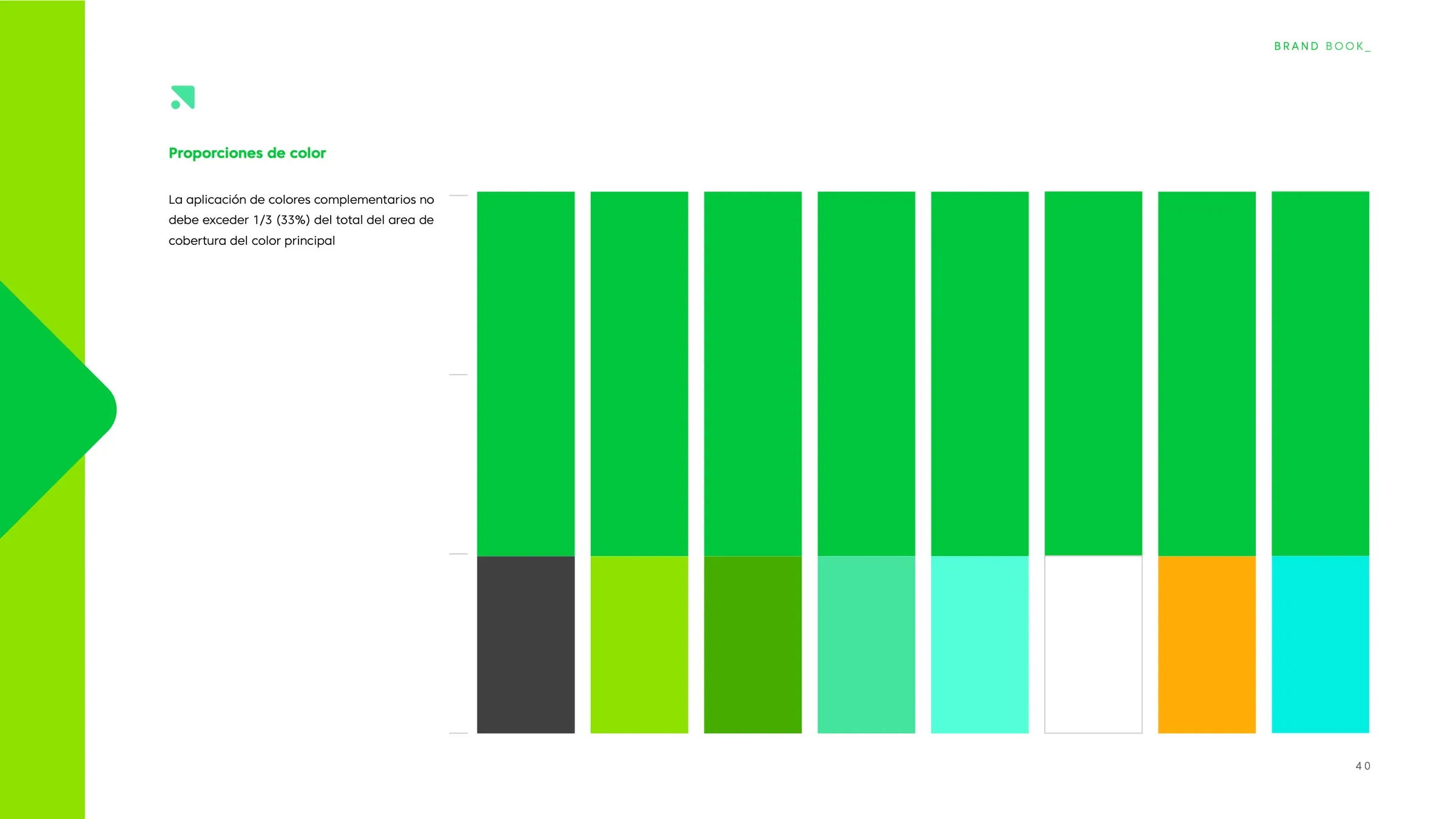
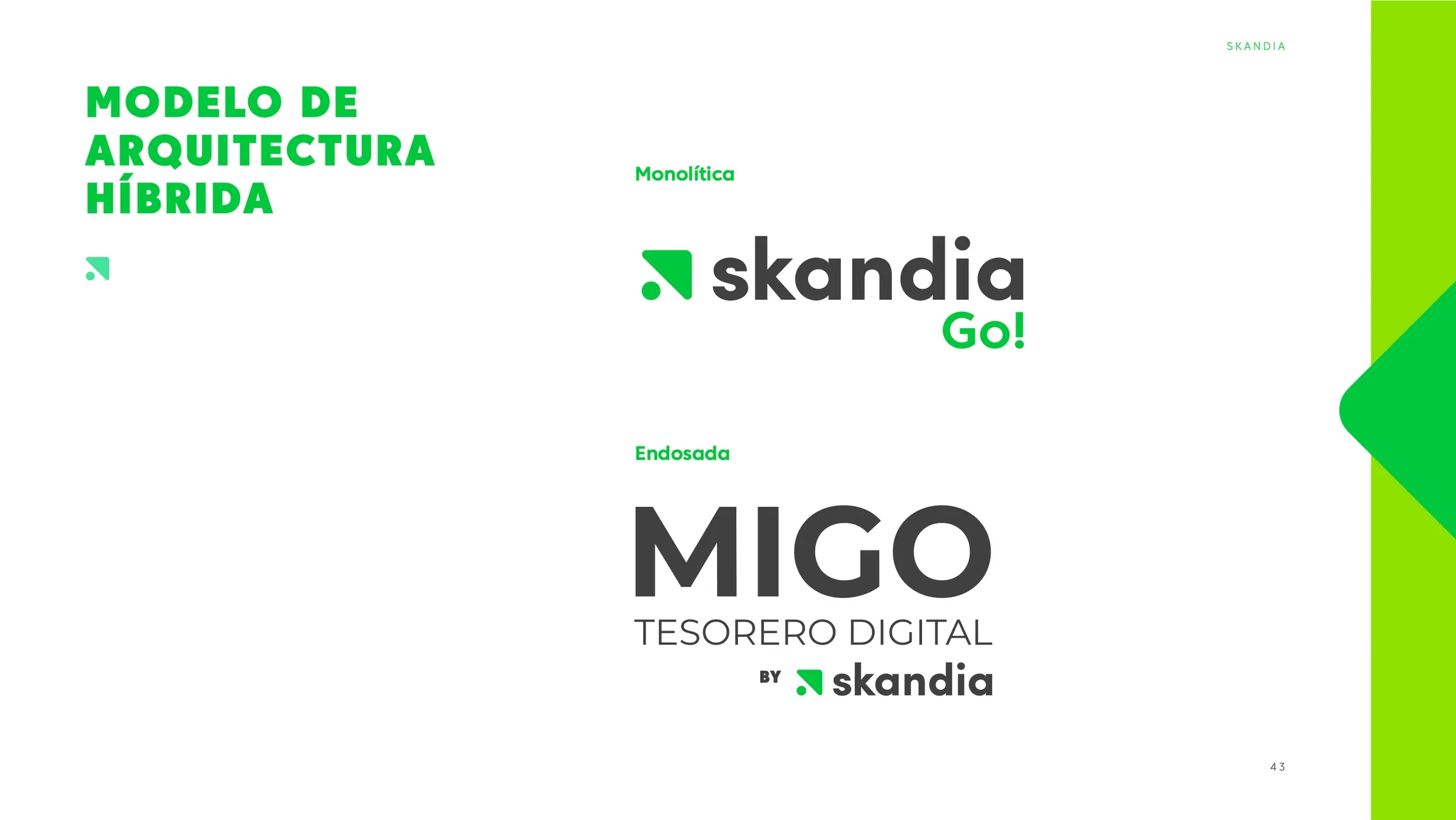
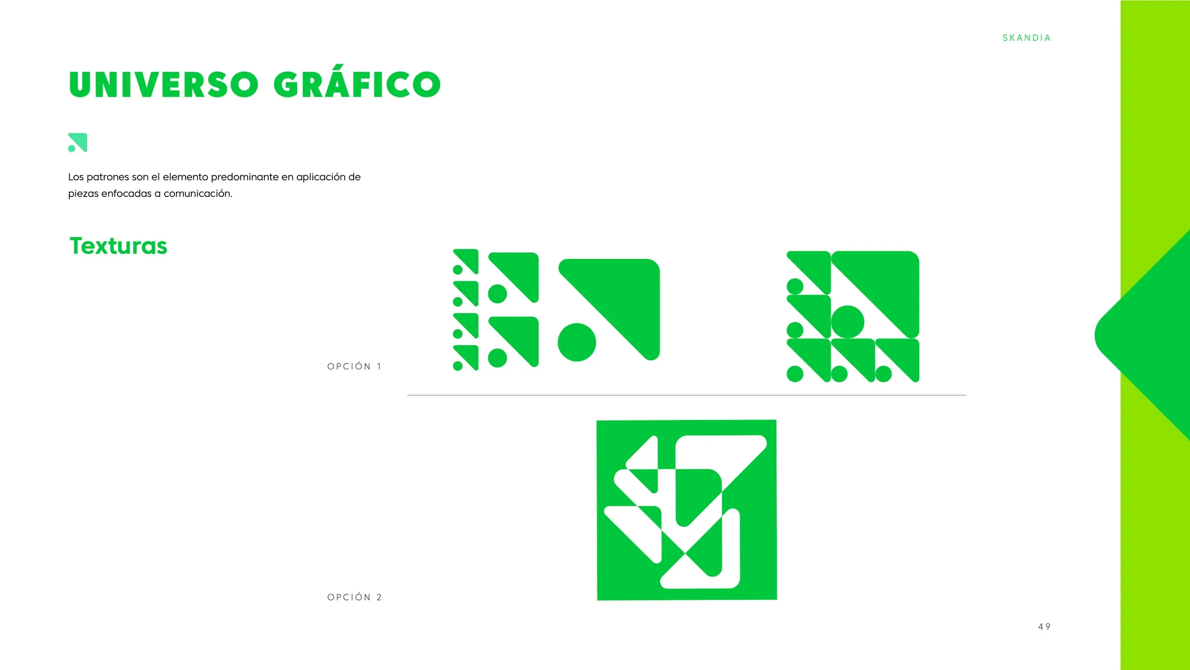
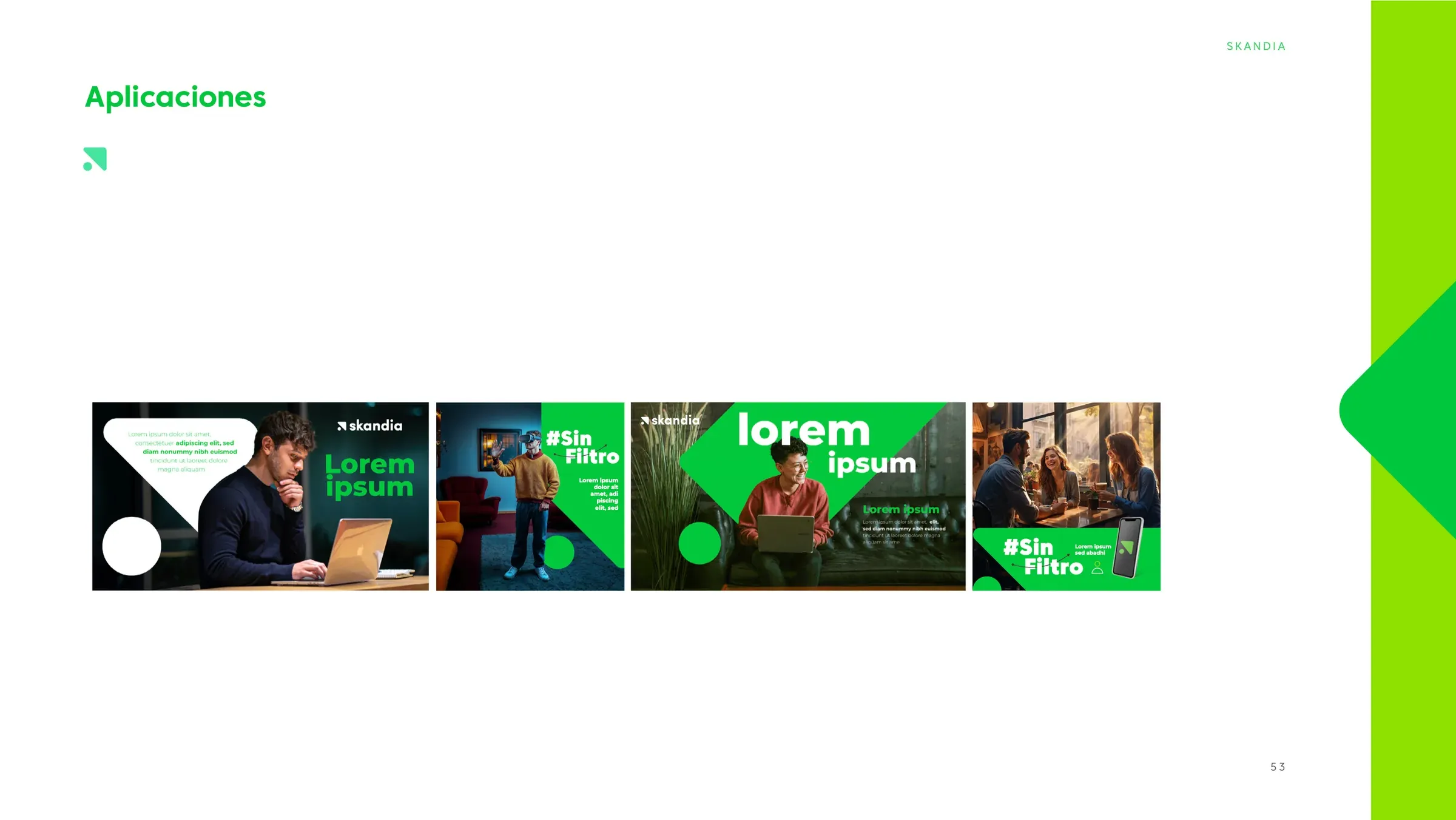
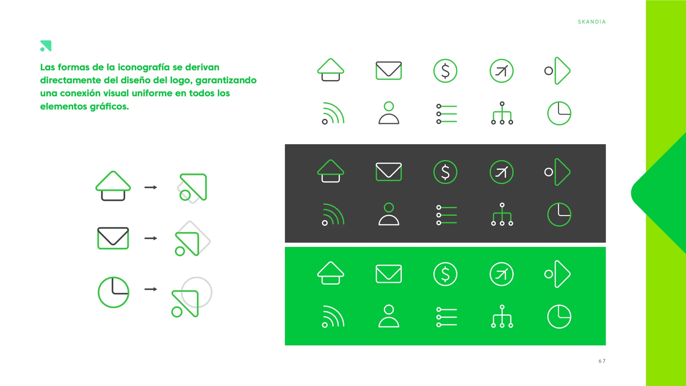
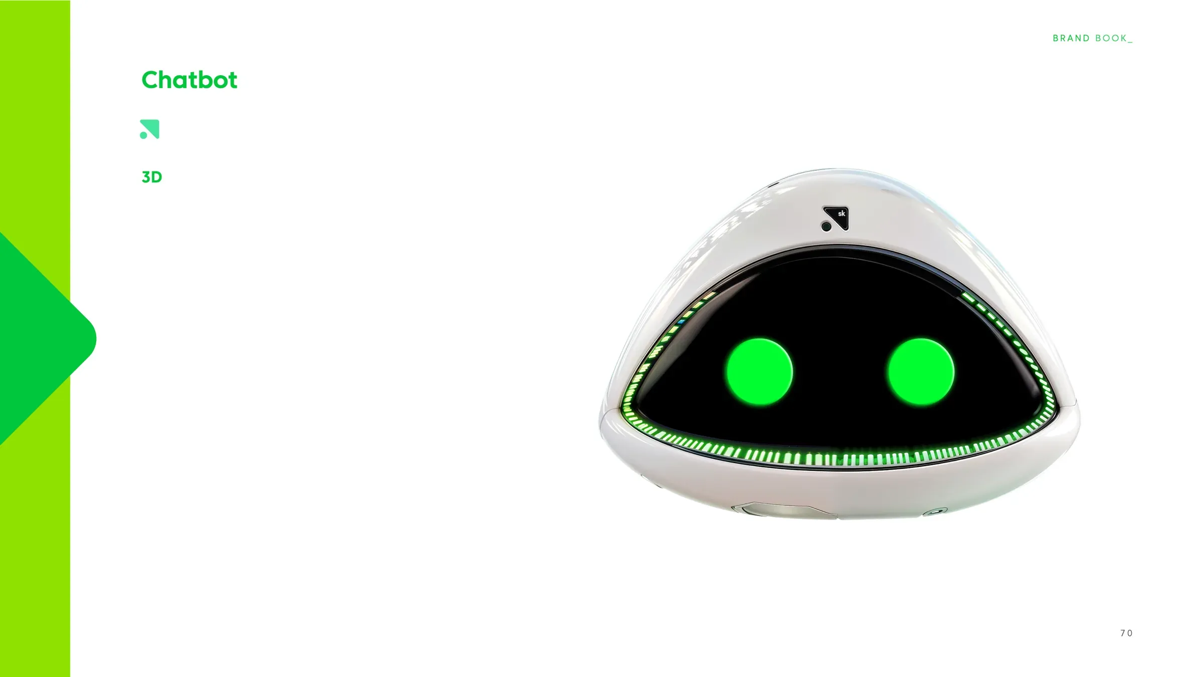
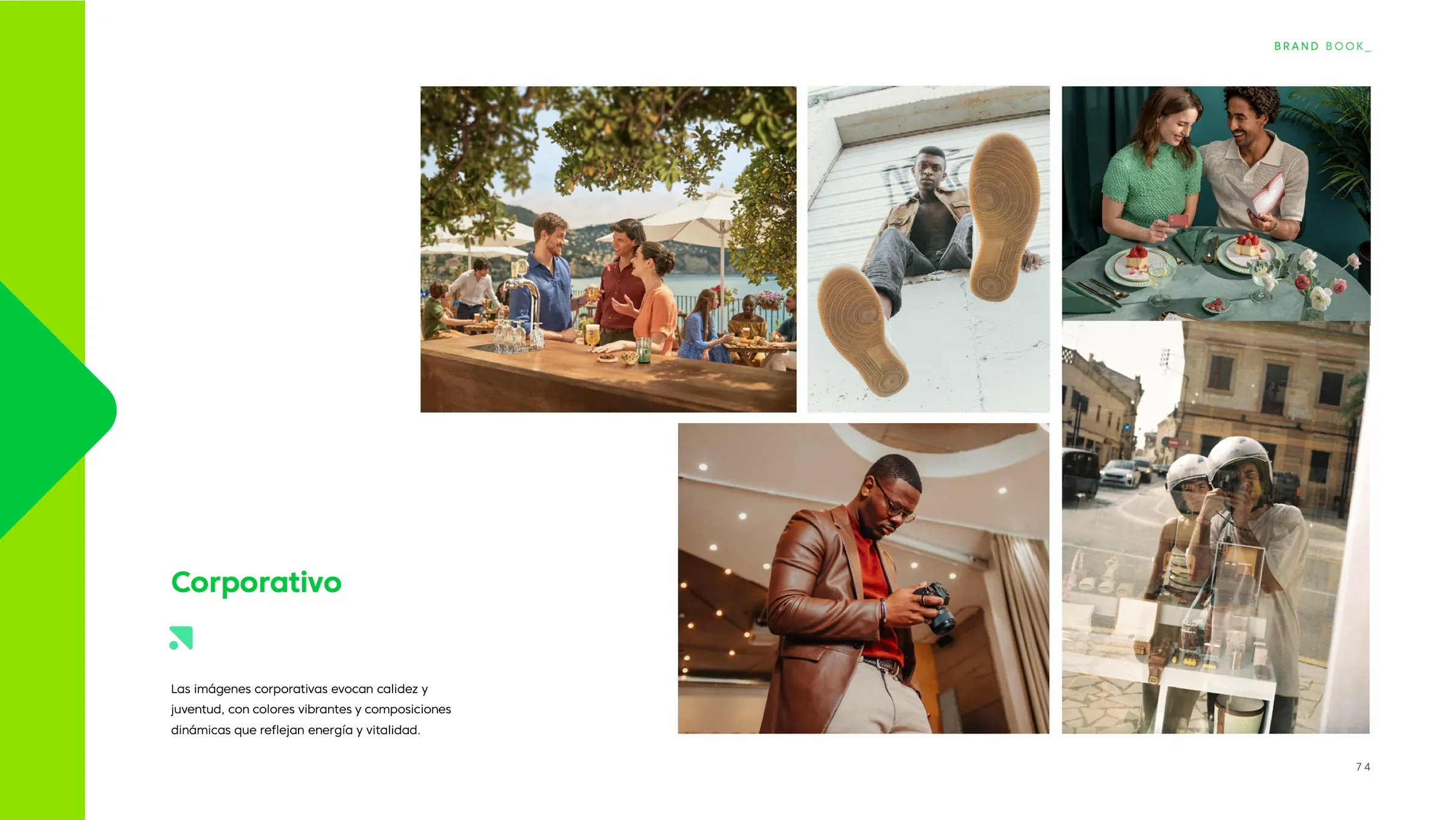
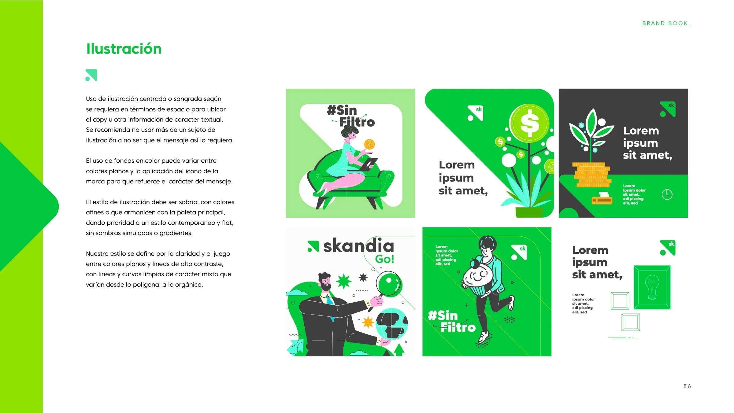
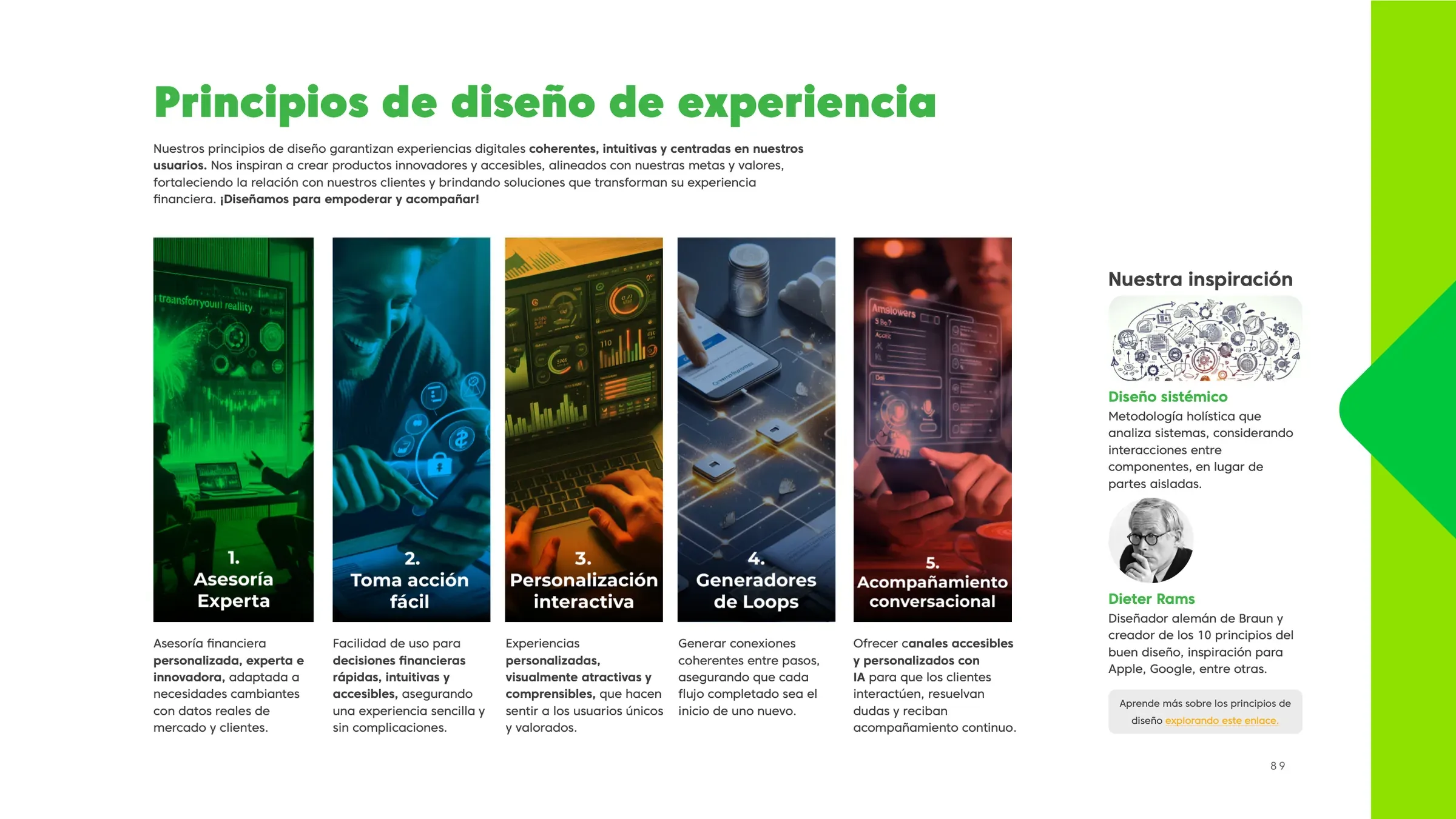
The core identity came from the Skandia group. My work was translating it for the Colombian market and making it usable at speed. The internal brand kit gave marketing a shared library of layouts, type rules and image direction, so a landing page and an Instagram post looked like the same company.
On top of that system we shipped key visuals for campaigns like "Bajo el lente", content for Skandia Channel, social pieces for Mexico, CREA Patrimonio materials, fintech product screens and a steady run of landing pages.
05
Results
Clients moved from Old Mutual to Skandia without a visual break in their journey. The new name looked established from the first statement they received.
The brand kit outlived the transition. It became the way the marketing team produced work, and it cut the back-and-forth on every request.
500+
touchpoints rebranded
during the Old Mutual transition