One brand architecture for a holding company and the crews it backs
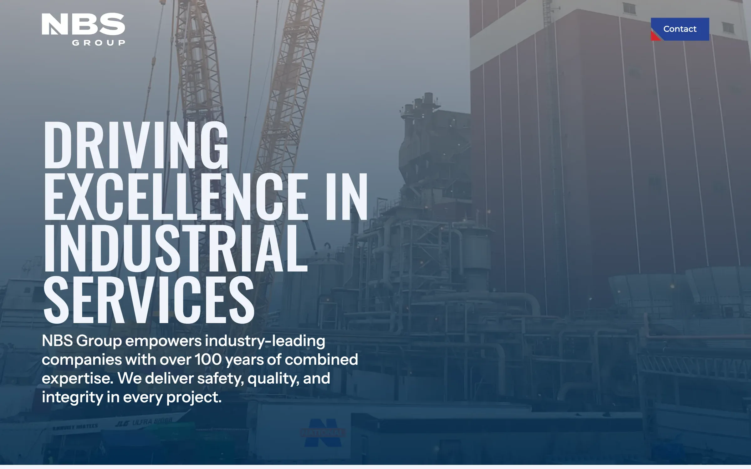
NBS Group is the holding company behind National Boiler and the other National lines. I built a brand architecture for the group and its operating brands, then designed and developed both websites in Webflow.
2
Webflow sites
designed and built on one system
4
service lines
organized under the National brand
65%
more RFQ inquiries
in the first 6 months after launch
30+
pages
across both websites
01
The client
NBS Group is the holding company for National Boiler and the other National lines. It gives its companies corporate oversight and shared services, from EH&S and QA/QC to HR, legal, finance, marketing, business development and IT. The leadership team brings more than 200 years of combined experience across power generation, pulp and paper, chemical, oil and gas, and process industries.
Its operating brand, National, is a full-service US industrial contractor with over 35 years in the field. It runs boiler, mechanical, construction and specialty services divisions, handles turnkey outages and 24/7 emergency response, and holds ASME and National Board accreditations. The work came through Effiqs in 2024 and 2025.
02
The challenge
The contractor still went by National Boiler Service, with an old badge-style logo and a dated website. The name tied it to one service line when it now ran four, and the look didn't match a company bidding against Fluor and Zachry. On top of that, the holding company above it needed its own identity, one for owners and partners rather than plant managers, with room for new companies as the group grows.
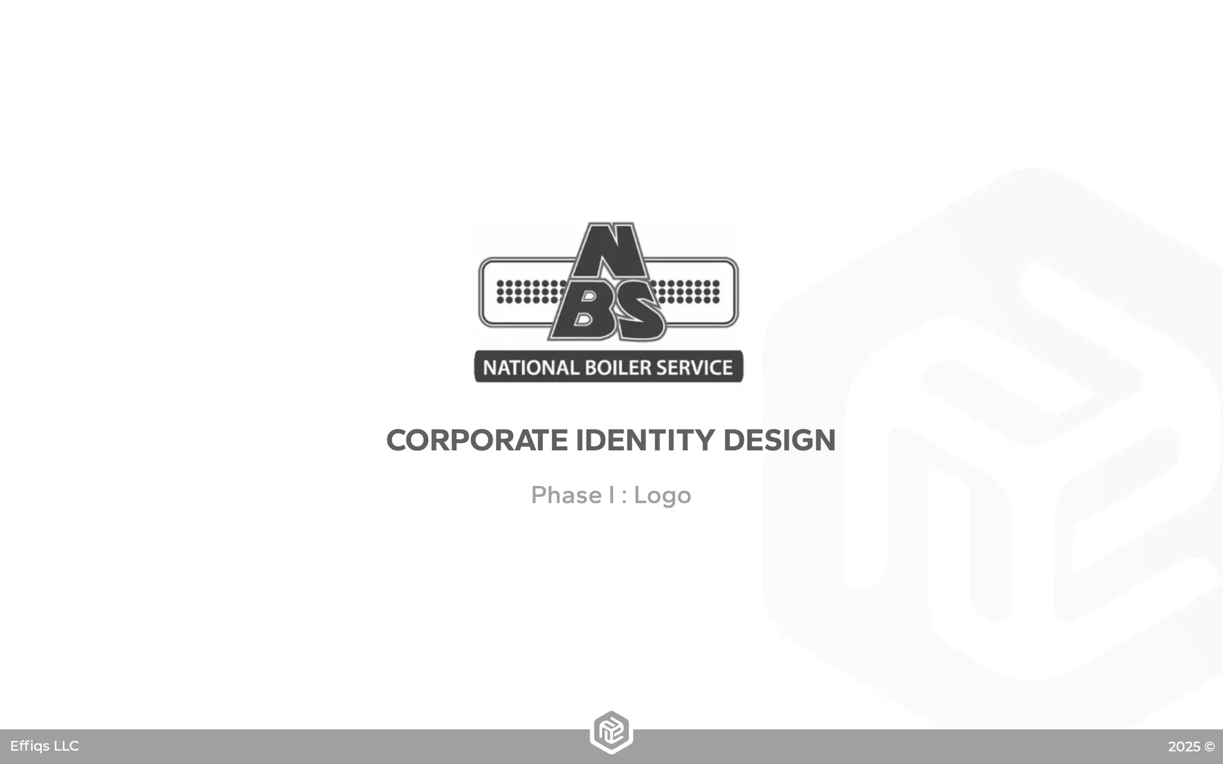
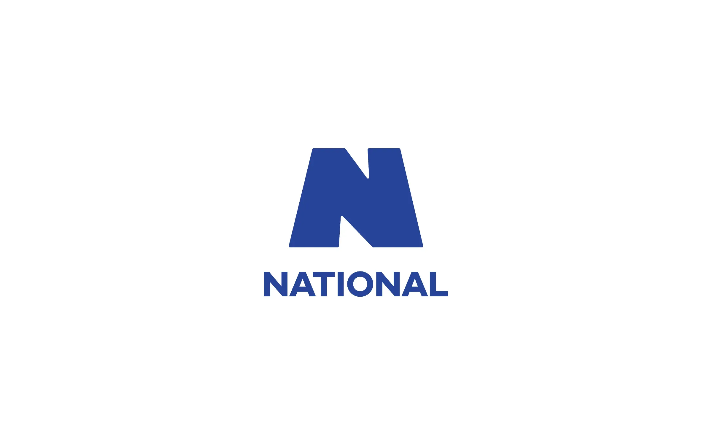
Drag to compare. Left: the National Boiler Service badge and old site. Right: the new National N and website.
03
The process
We started with the market, then built the mark on a grid until every decision could be defended.
- 01Competition audit. Direct and indirect players like MMR, Brown & Root, Madison, Zachry, Fluor, Yates and PCI, to see where National could stand apart.
- 02Path I, "Legacy Point.". A geometric N that keeps the weight of 35+ years instead of throwing it away.
- 03Path II. A second route explored in parallel, so the choice was a real one.
- 04Grid construction. The N rebuilt on a grid, angle by angle.
- 05Casing. National vs NATIONAL, tested at every size before we settled it.
- 06Color explorations. Clean, background and border-width variations, all in color.
01 / 10
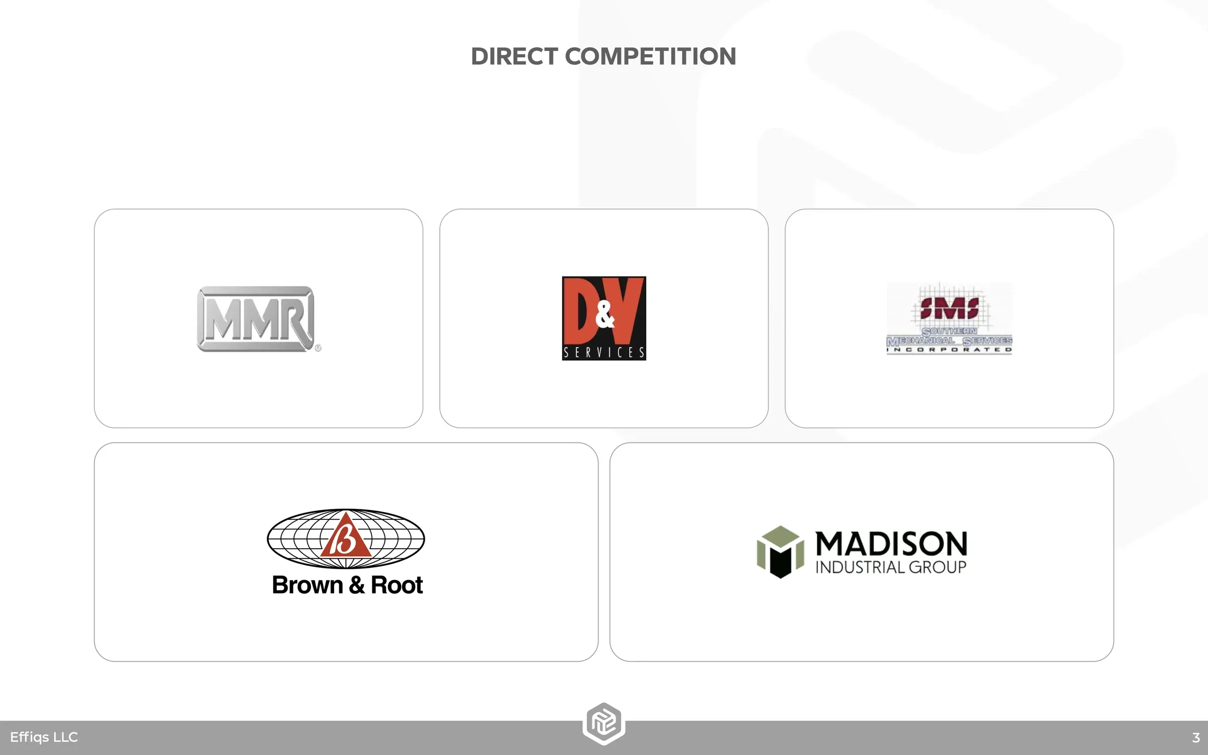
Direct competition
02 / 10
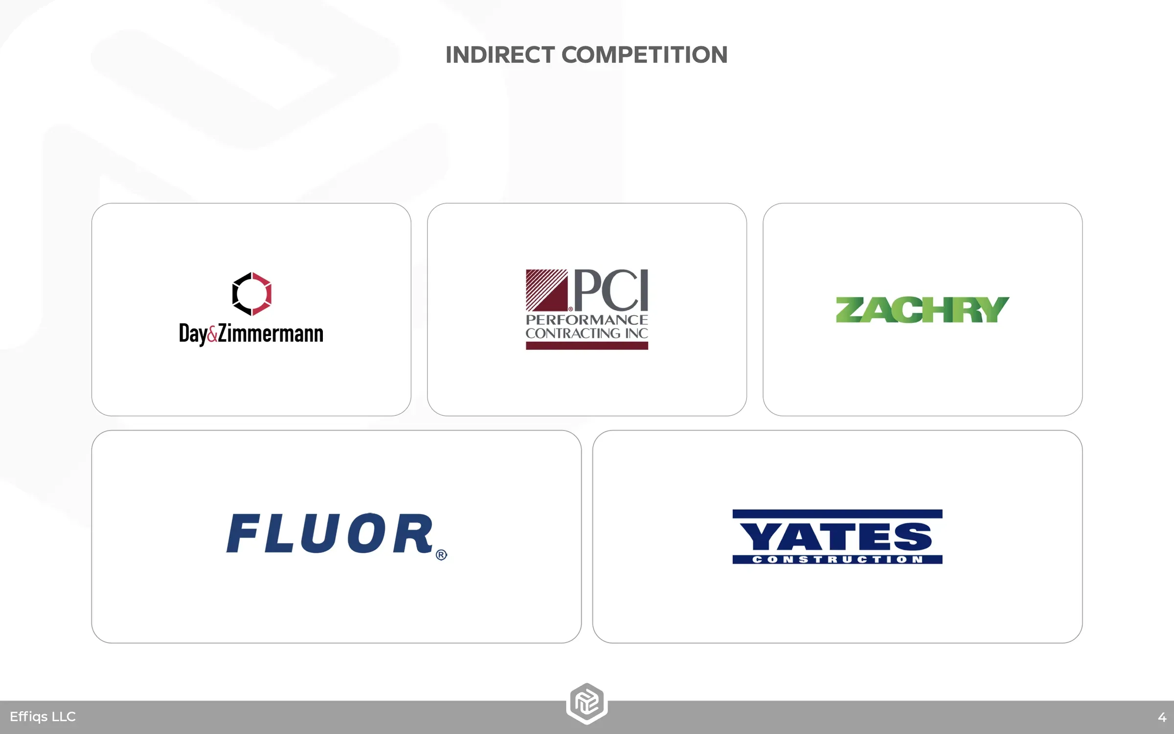
Indirect competition
03 / 10
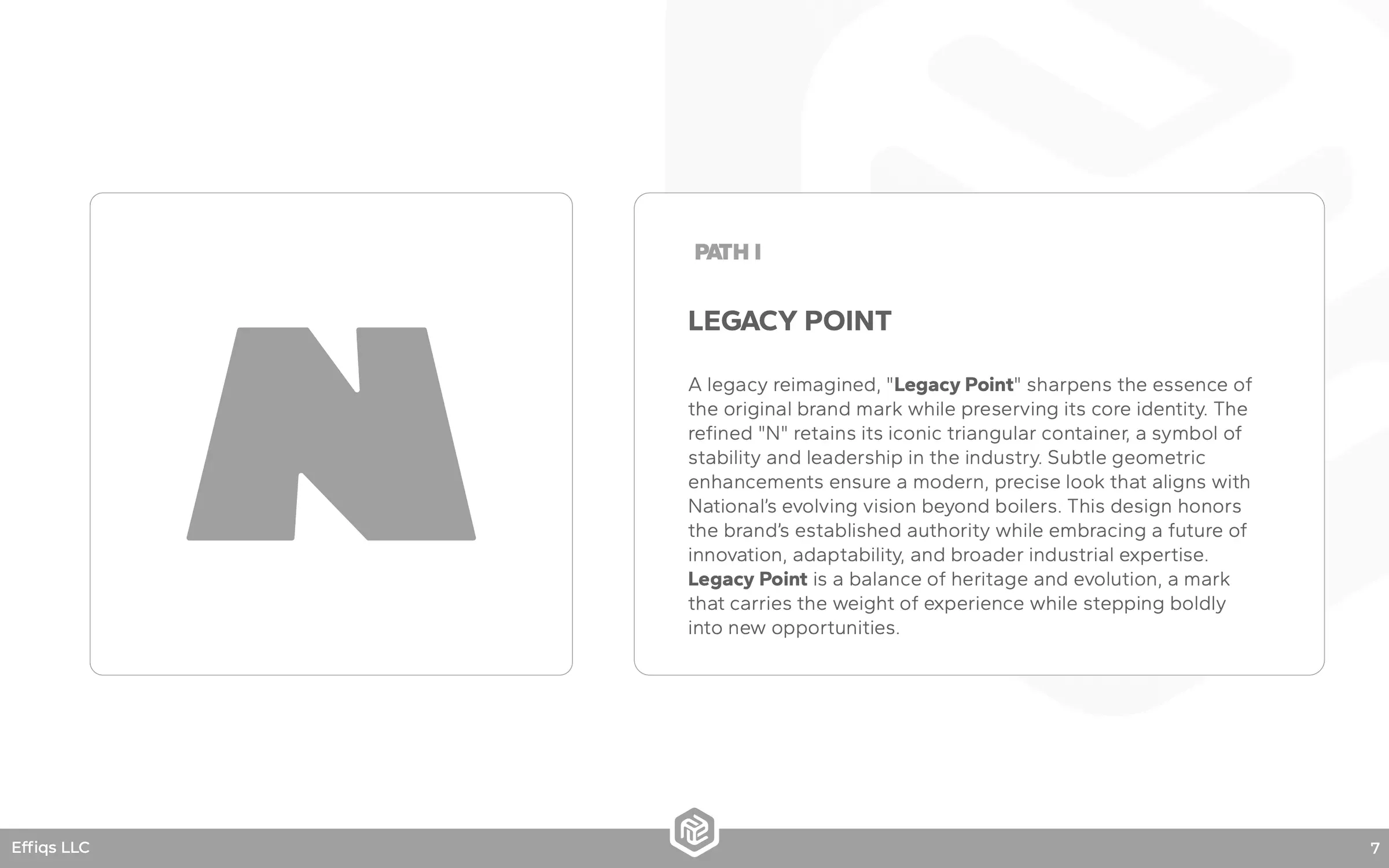
Path legacy point
04 / 10
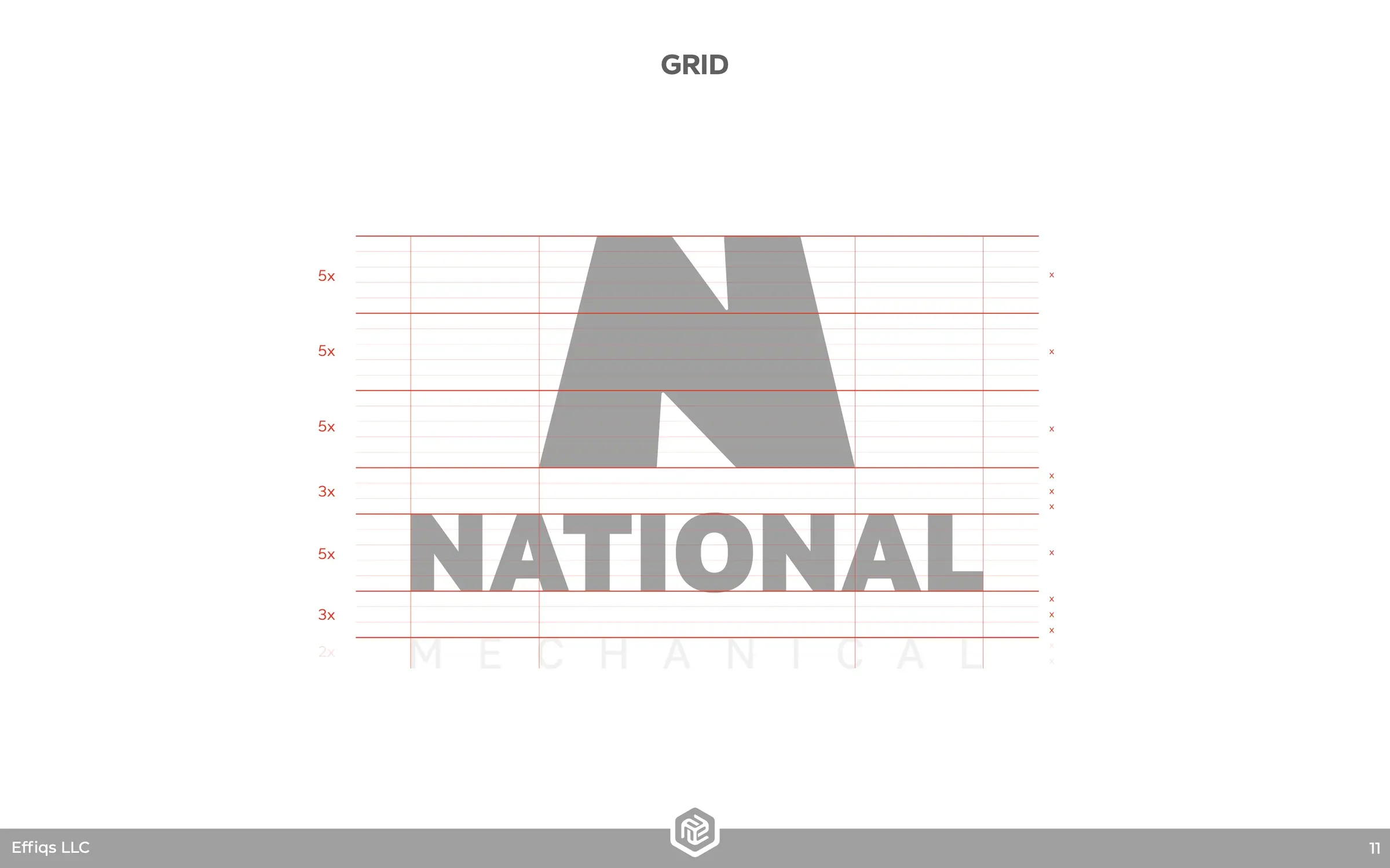
Grid
05 / 10
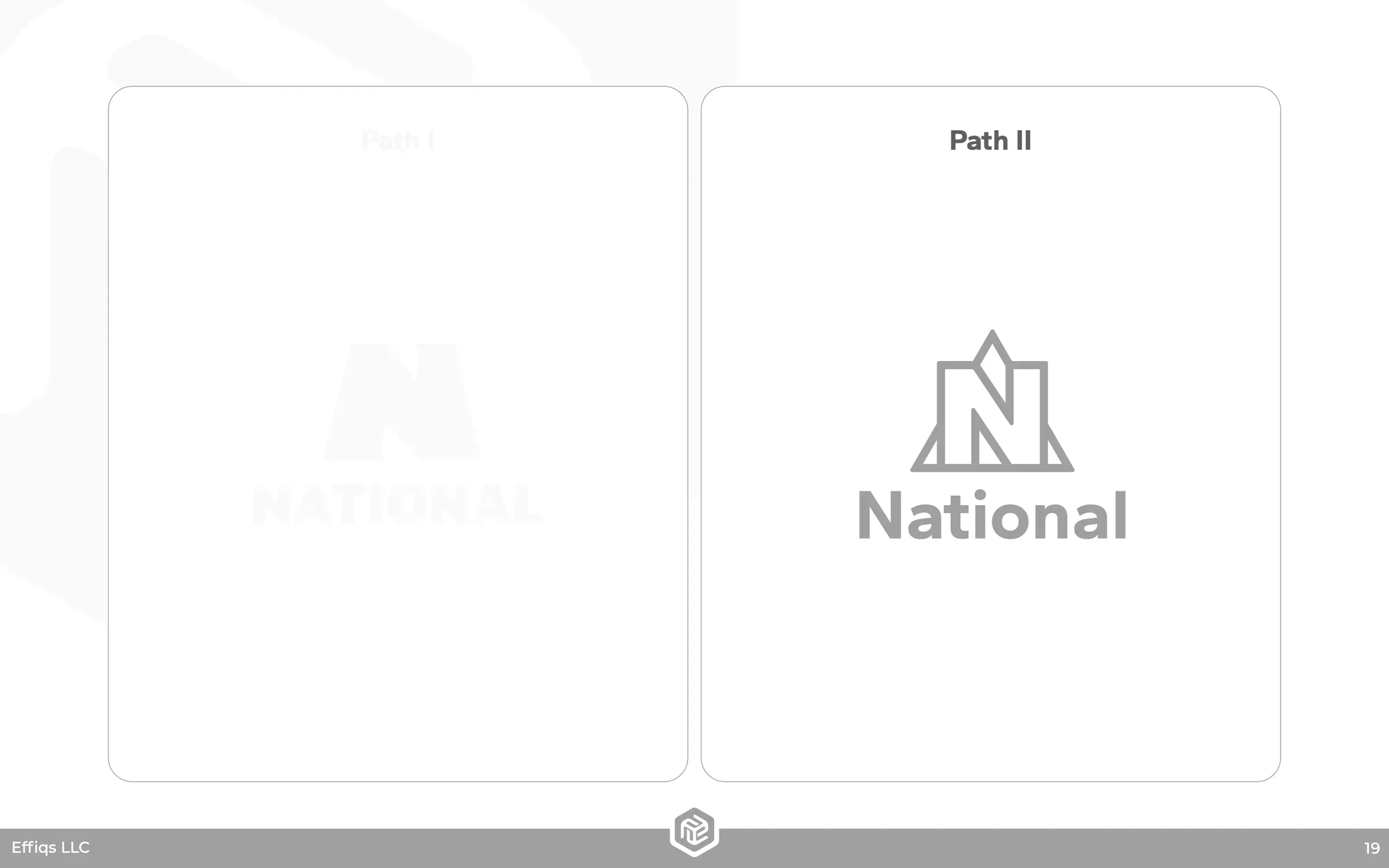
Path two
06 / 10
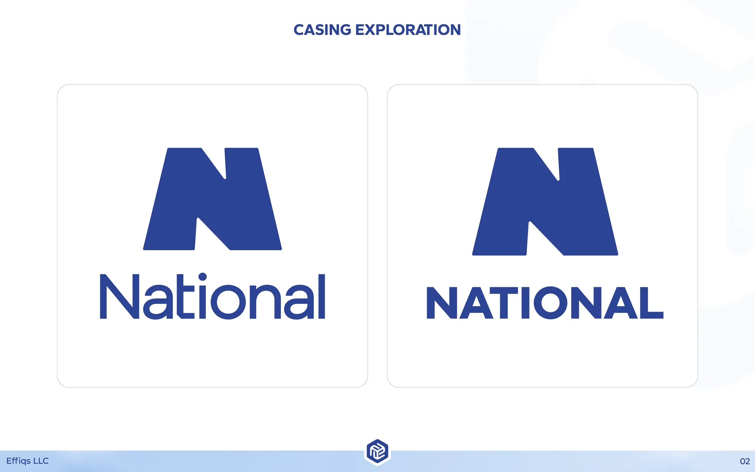
Casing
07 / 10
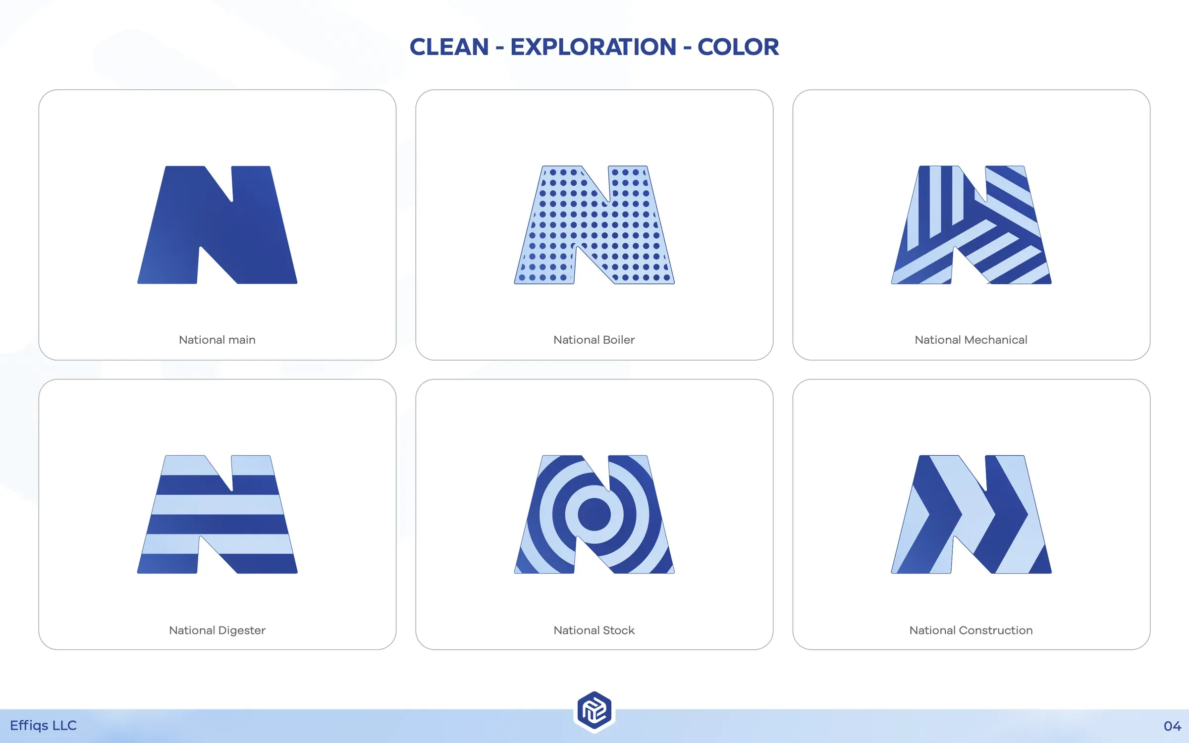
Clean color
08 / 10
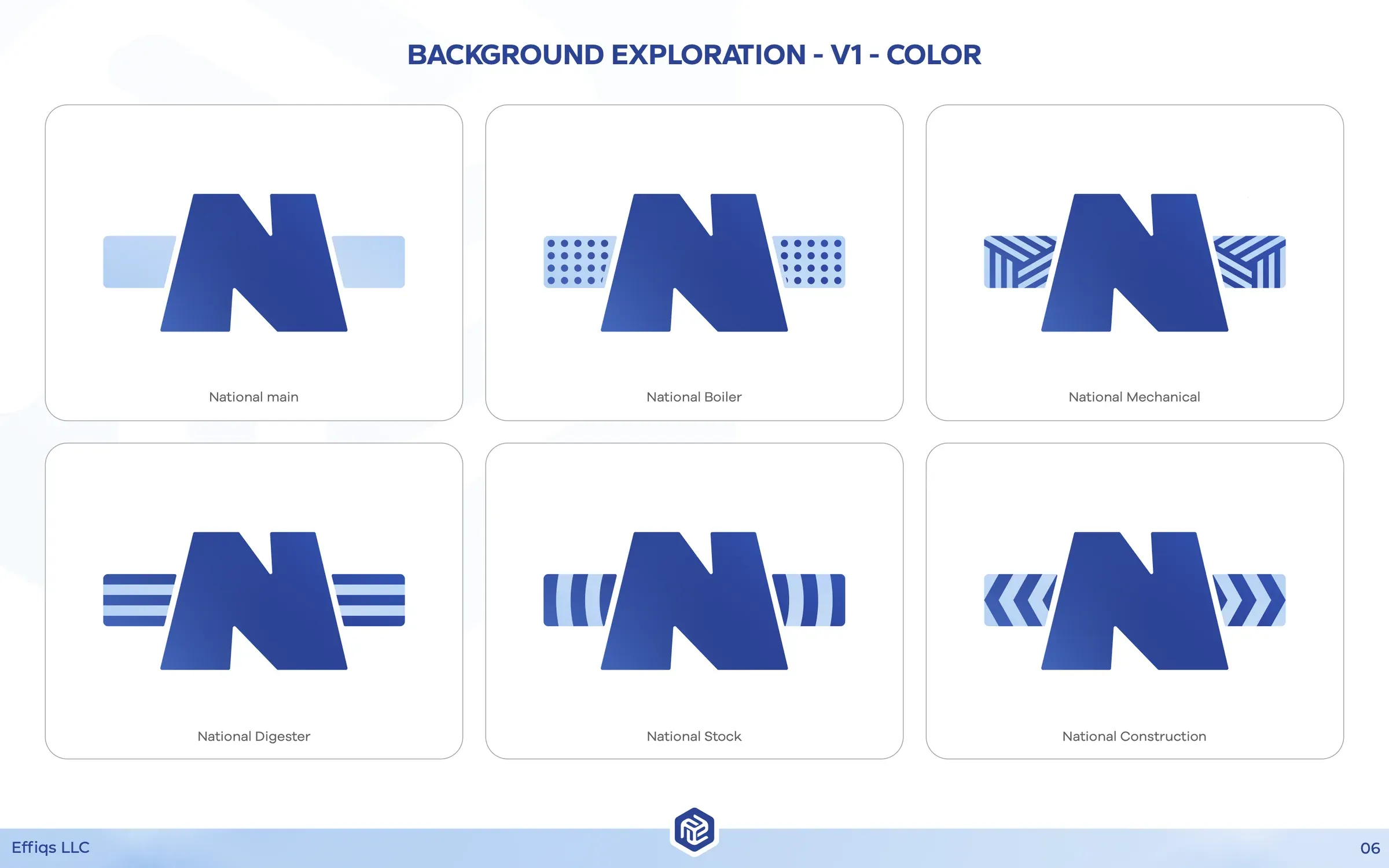
Background v1
09 / 10
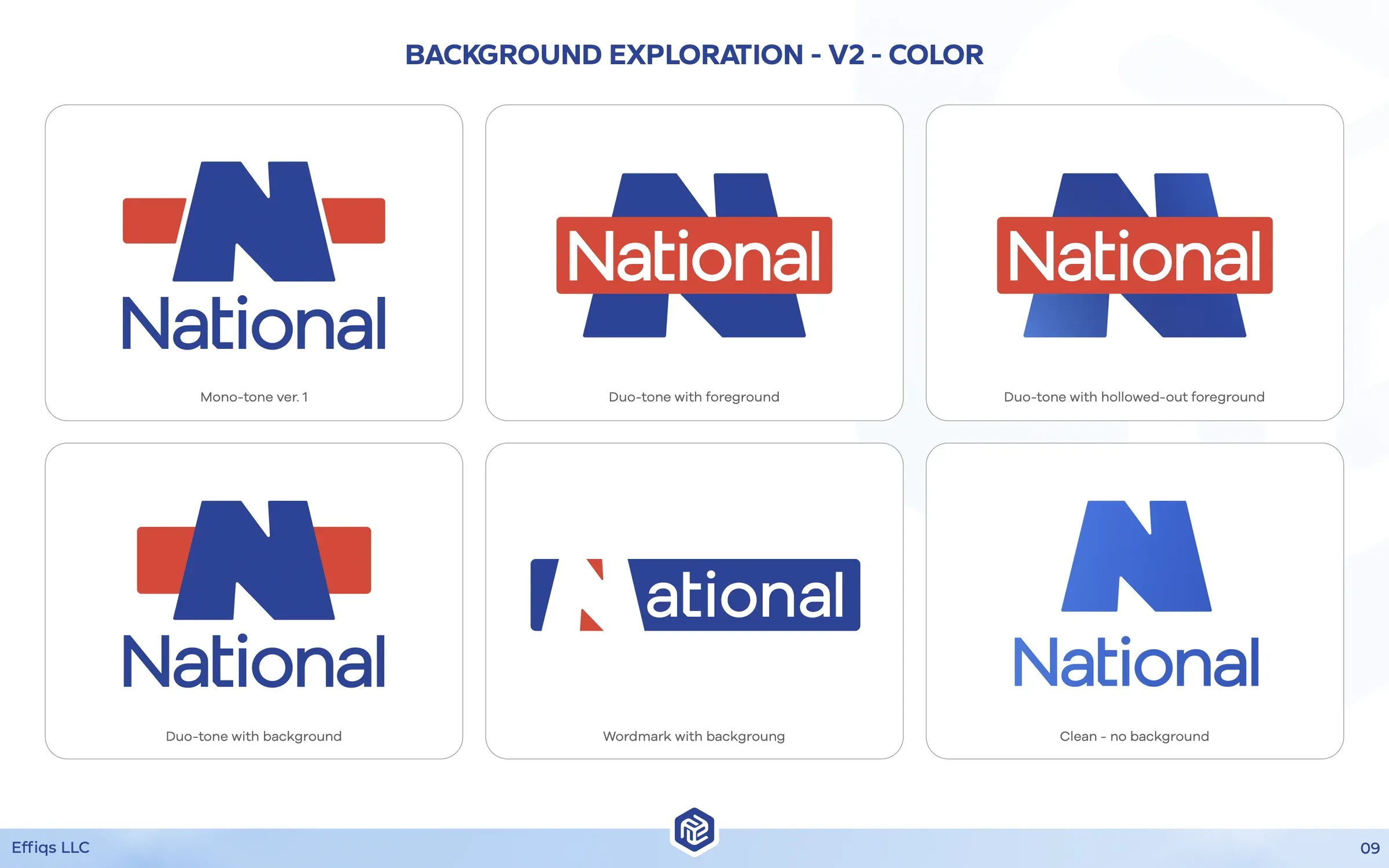
Background v2
10 / 10
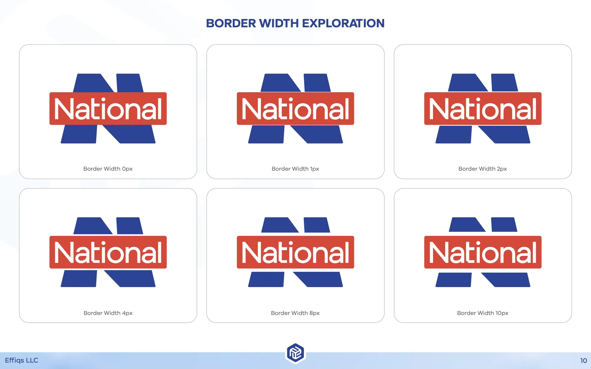
Border width
04
The solution
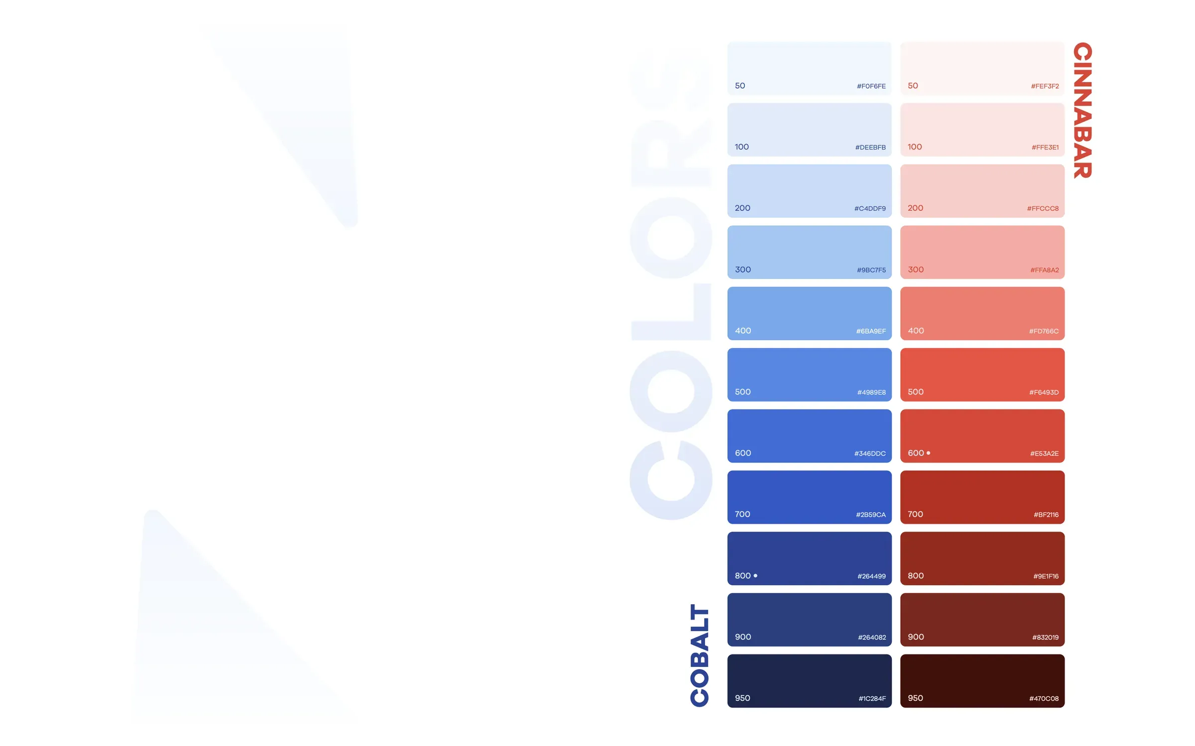
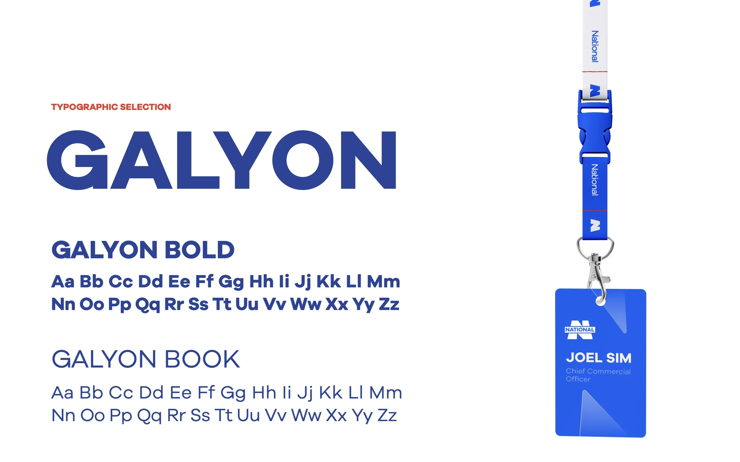
The new identity is a bold cobalt-blue N paired with a cinnabar NATIONAL wordmark band. It reads from across a job site and still looks sharp on a proposal cover. Galyon, in Bold and Book, carries the type, and full Cobalt and Cinnabar color scales give the team room to work beyond two flat colors.
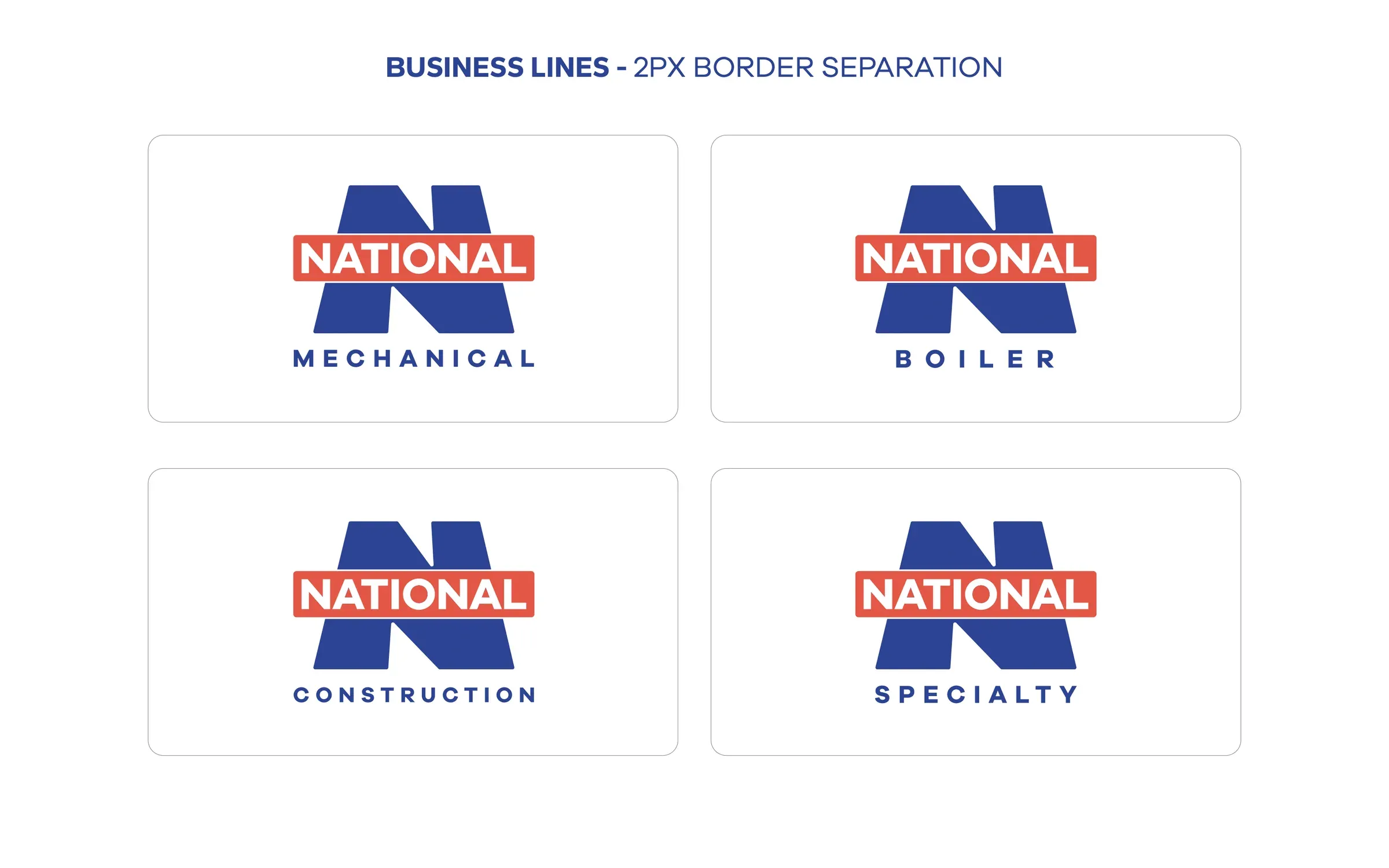
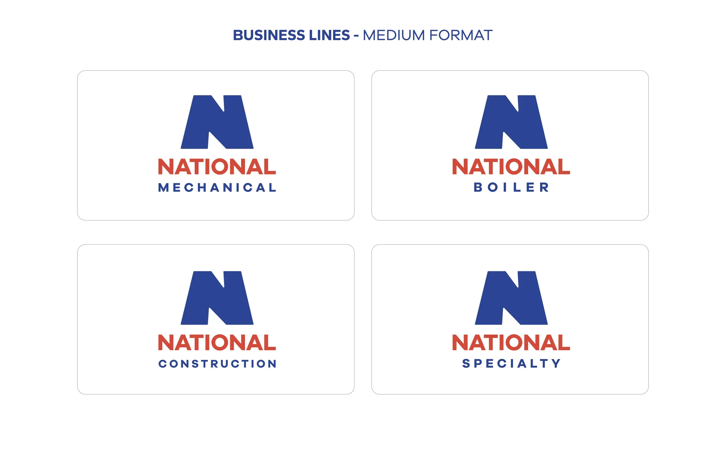
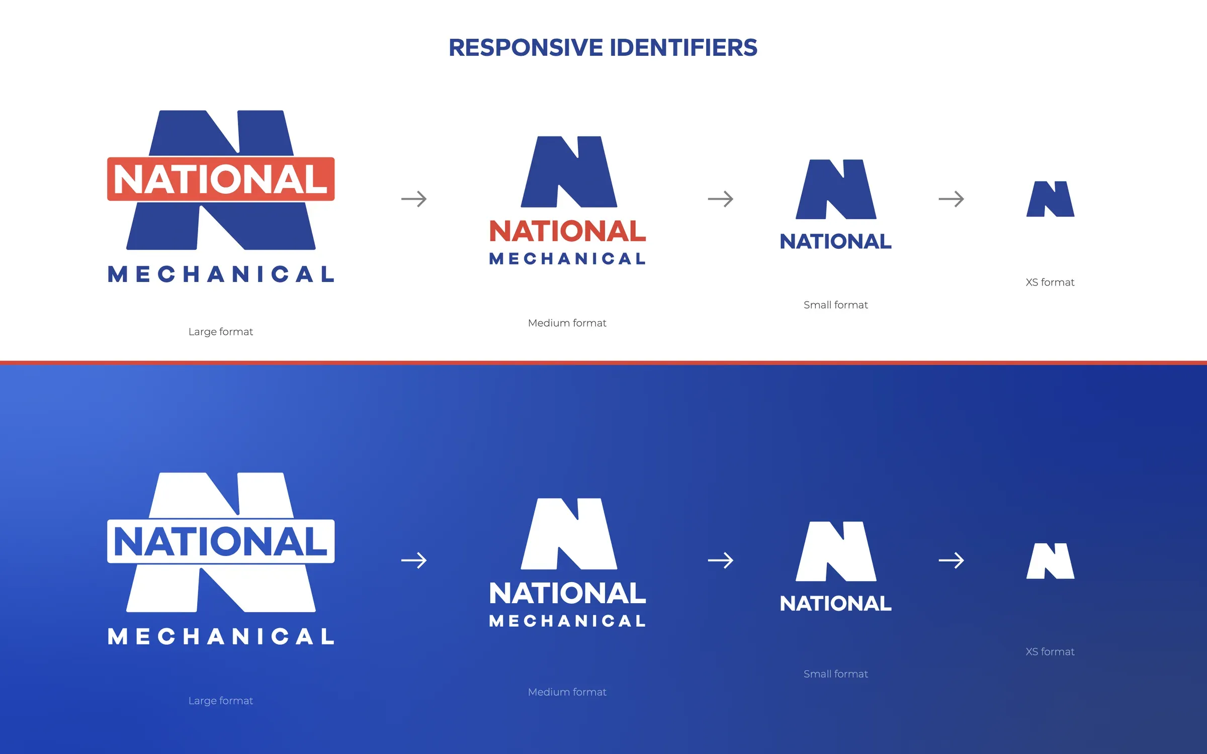
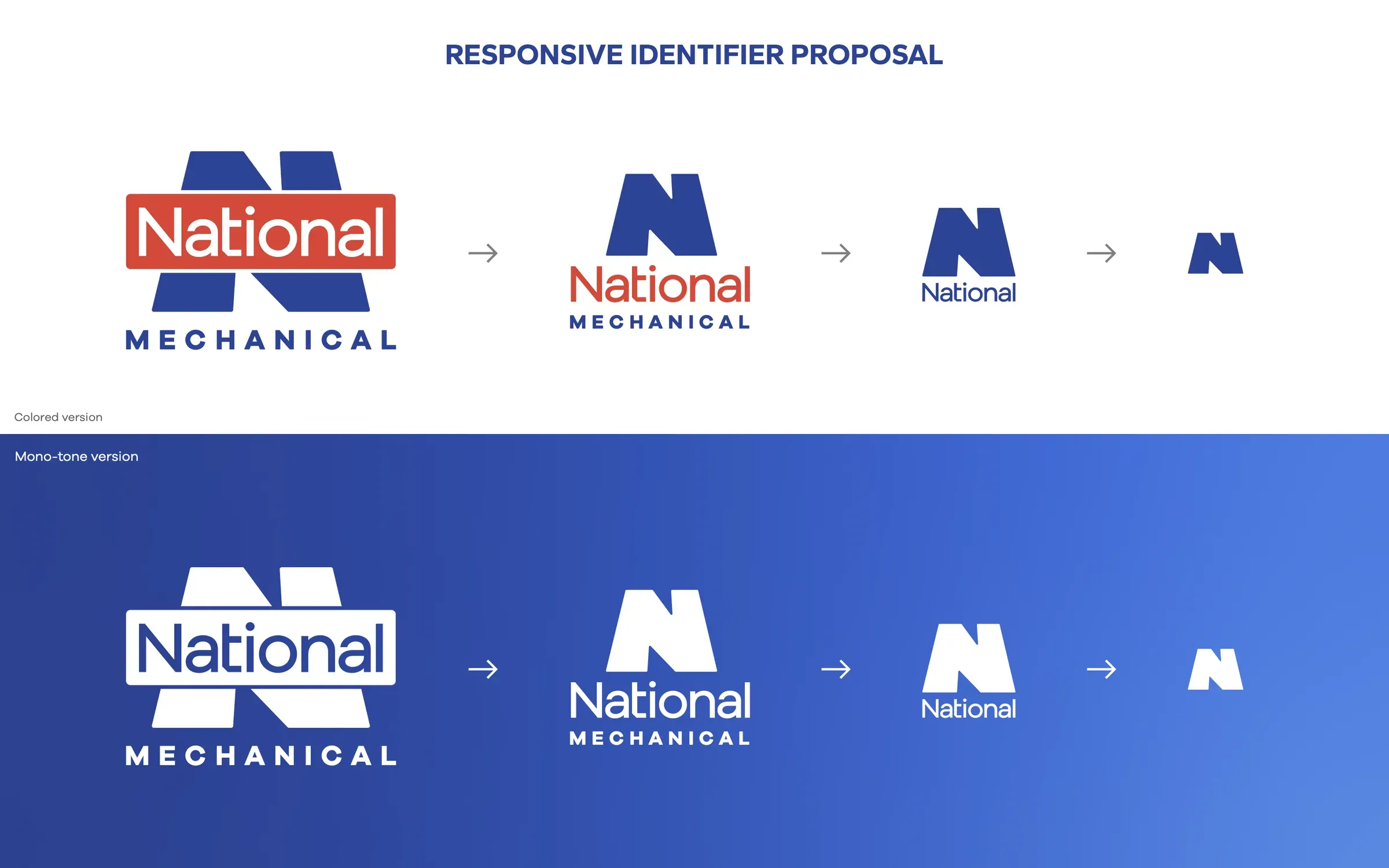
Each business line gets its own sub-brand (National Boiler, National Mechanical, National Construction and National Specialty), so a division can stand on its own and still be obviously National. Responsive identifiers scale the brand from the full lockup down to the N alone. A stylescape and production package took it onto ID badges, billboards, business cards, reports and packaging.
Above it, the parent got its own NBS GROUP logotype and a line card that shows every company in the family. I then designed and built both websites in Webflow: nbsgrp.com for the group, nationaldelivers.com for the contractor, which leads with "Safety, Quality, Execution Excellence."

05
Results
The group now has a structure it can add companies to without redesigning anything. A new line slots into the architecture instead of starting from scratch.
Both sites launched as designed, because the person who drew the system also built it. Owners see a serious holding company; plant managers see a contractor ready to show up.
2
Webflow sites
designed and built on one system